
Today we will be working through creating our very own SwiftUI style Button. How to reproduce the button behavior has been sought after since the release of SwiftUI almost a year ago.
Disclaimer: This is the way I found to recreate the behavior, I don’t and probably will never know how Apple made their button.
After creating the initial logic for the button I will also provide the code for how to make custom styles. I will not be covering custom styling because it has already been perfectly covered here.
Getting Started
Let’s breakdown the expected behavior.
- User can tap the button causing its action to be performed
- User can press and drag out of the button.
- If the user releases the drag outside of the button, no action is performed
- If the user drags back inside the button and releases the action is performed.
At first I had believed this to be a bunch of gestures (Tap, Longpress and Drag) all combined into a single sequenced gesture. After giving it some thought I realized the entire behavior can be replicated with only a DragGesture using a 0 minimum distance value.
Knowing this we should create an enum to represent the state of our button.
enum ButtonState {
        case inactive
        case outside
        case inside

        var isPressing: Bool {
            switch self {
            case .inside:
                return true
            default:
                return false
            }
        }

        var isActive: Bool {
            switch self {
            case .inside, .outside:
                return true
            default:
                return false
            }
        }
    }
While we are at it lets make a view with an State value of type ButtonState
struct MyButton: View {
enum ButtonState { ... }
@State private var state: ButtonState = .inactive
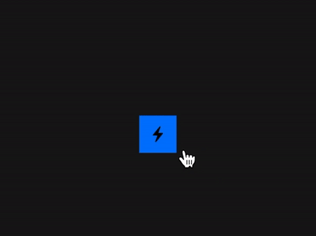
var label: some View {
Image(systemName: "bolt.fill")
.padding()
.background(state.isPressing ? Color.orange : Color.blue)
}
var action: () -> Void = { print("Triggered") }
var body: some View {
label
}
}
Here I preemptively created a variable for our buttons label. While the button is pressing the background will change from blue to orange.
To be able to tell if the drags location is currently inside of the our button we will need to know the size of the buttons bounds. Getting this size is easy if we use a PreferenceKey to get the Anchor<CGRect> of the label and then convert that into a CGRect by using GeometryReader.
- Create a
PreferenceKeyconforming struct with aValueof typeAnchor<CGRect> - Call the
anchorPreference(key:, value:, transform:)method on the label - Call the
overlayPreferenceValuemethod - Use our label again but this time nested into a
GeometryReader - Make the
DragGesture - Use the Anchor
as a subscript of the `GeometryProxy` to return a `CGRect`. - Check if the gestures location is inside of the
CGRect
So first making the Key
// 1
struct ReactiveButtonKey: PreferenceKey {
    static var defaultValue: Anchor<CGRect>? { nil }
    static func reduce(value: inout Anchor<CGRect>?, nextValue: () -> Anchor<CGRect>?) {
        value = nextValue()
    }
}
The body of our button should now look like this:
var body: some View {
        label
            // 2
            .anchorPreference(key: ReactiveButtonKey.self, value: .bounds, transform: { $0 })
            // 3
            .overlayPreferenceValue(ReactiveButtonKey.self) { (bound) in
            // 4
                GeometryReader { proxy in
                    self.label
            // 5
                    .gesture(DragGesture(minimumDistance: 0)
                        .onChanged({ (value) in
                            guard let bounds = bound else { return }
            // 6
                            let rect: CGRect = proxy[bounds]
            // 7
                            self.state = rect.contains(value.location) ? .inside : .outside
                    }).onEnded({ (value) in
                       guard let bounds = bound else { return }
                       let rect: CGRect = proxy[bounds]
                        if rect.contains(value.location) {self.action()}
                        self.state = .inactive
                    }))
                }
        }
    }
Running the simulator should show a button like this:
Link To Full Button Code
ReactiveButton comes with full custom styling capabilities. It’s a MyButton on steroids!